10 Graphs & Infographics: A Quality Selection

I’ve always been a fan of the odd graph or two, I don’t see how you can’t like graphs to be honest? All of that beauty, art and knowledge wrapped into a bite sized, easy on the eye, info-nugget. What’s not to like?
In the modern era of “big data” these things are churned out like popcorn in a cinema, and that shouldn’t put us off. Us humans get sick of hearing about things pretty quickly; I was very excited by the term big data when it first started getting banded about, and then like everything else that’s often repeated I started getting jazzed off with it. I just wanted people to stop showing off about how many numbers they owned. But that was silly of me. I know.
So I’ve popped together a bunch of graphs and infographics that I personally think are pretty interesting (if a little pointless), and I hope you do to. Most images will increase in size if you give them a quick click:
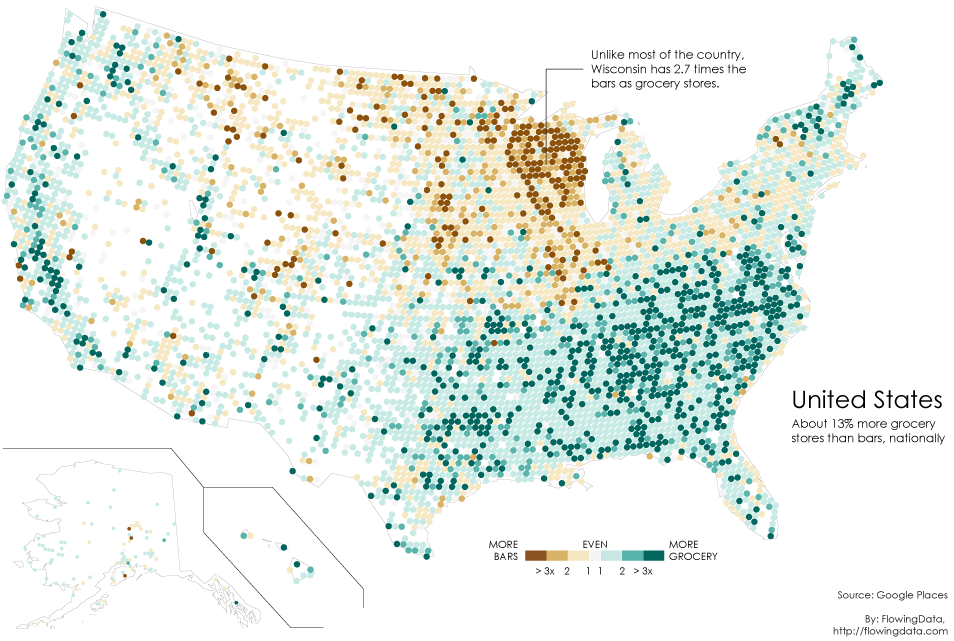
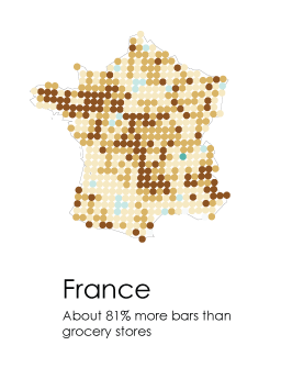
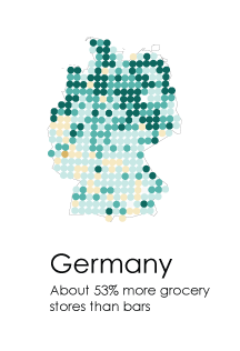
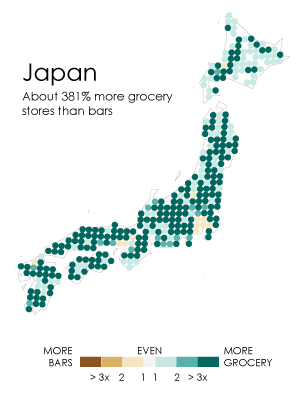
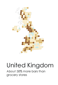
1) Grocery Stores Vs Bars
So we’ll start with some maps that show which regions of each country have more bars than grocery stores. Is this important information? No, I suppose it isn’t.
The data comes from Google Places API and was lovingly collated manually. The greener the dots, the more grocery stores there are and the browner the dots the more bars…
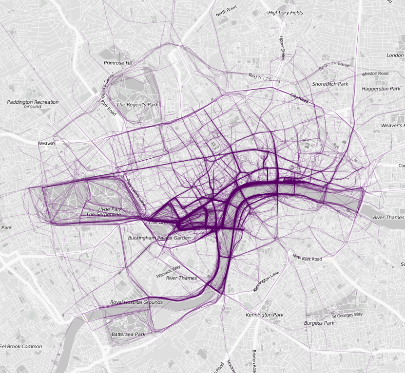
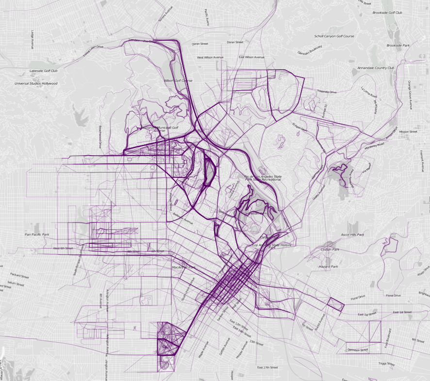
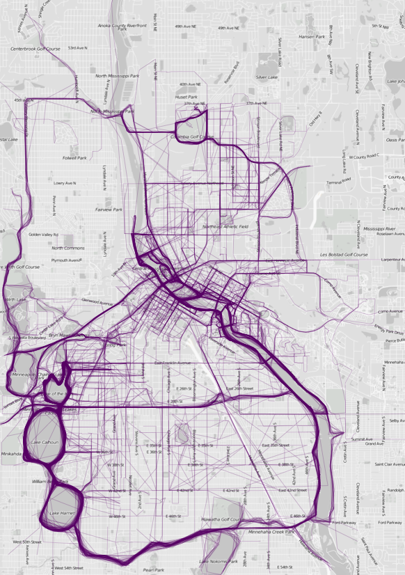
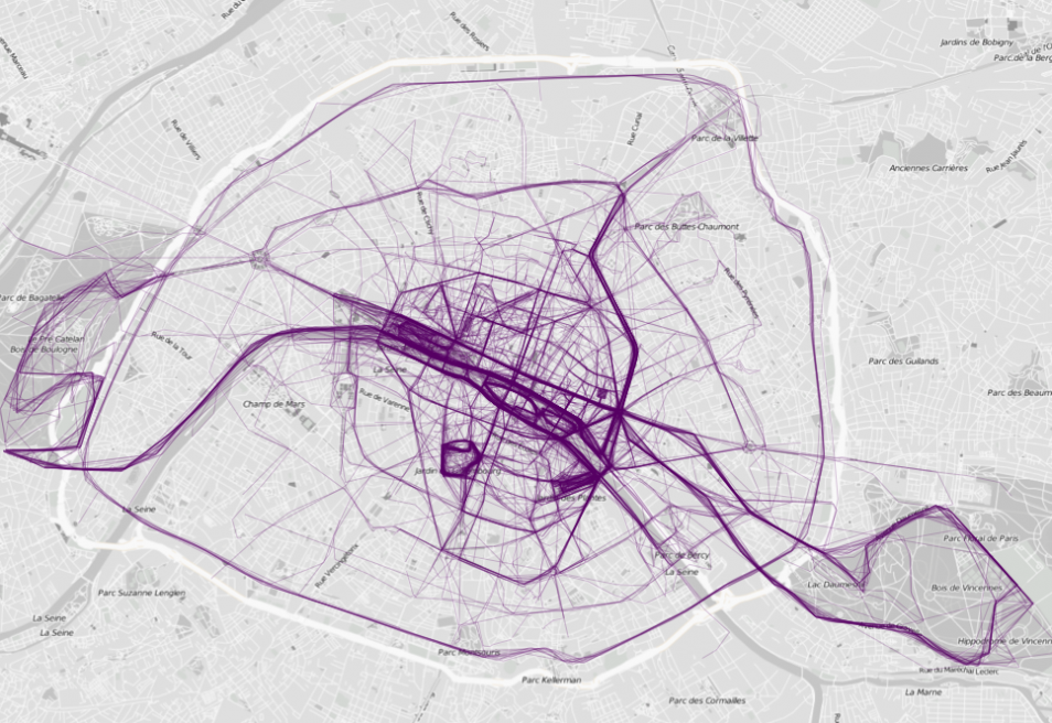
2) Where People Run
People love all this running around malarkey these days and with the invention of more and more hi-tech ways of registering how far you’ve gone and showing off about it, this data is now easily collected. The maker of these maps used data from RunKeeper.
It’s useless information I guess, but it’s in such a lovely format.
London
Los Angeles
Minneapolis
Paris
3) Obesity In The US
We’re all getting fatter, and this video charts the fattness of America from 1985-2009… which state will win the booby prize!?
4) Fire Engine Call Outs
Made with data taken from the London Fire Brigade, they’ve mapped out in glorious technicolour the trips that our hard working fire chaps have had to make. Each of the 144,000 lines is a single trip made by a fire truck. It’s sort of ironic that it looks like a massive fireworks accident…

MORE DATA SHENNANIGANS:
META-ANALYSIS – LESS BORING THAN YOU THOUGHT?
GOOGLE TRENDS WILL OPEN YOUR EYES