
10 Graphs & Infographics: A Quality Selection
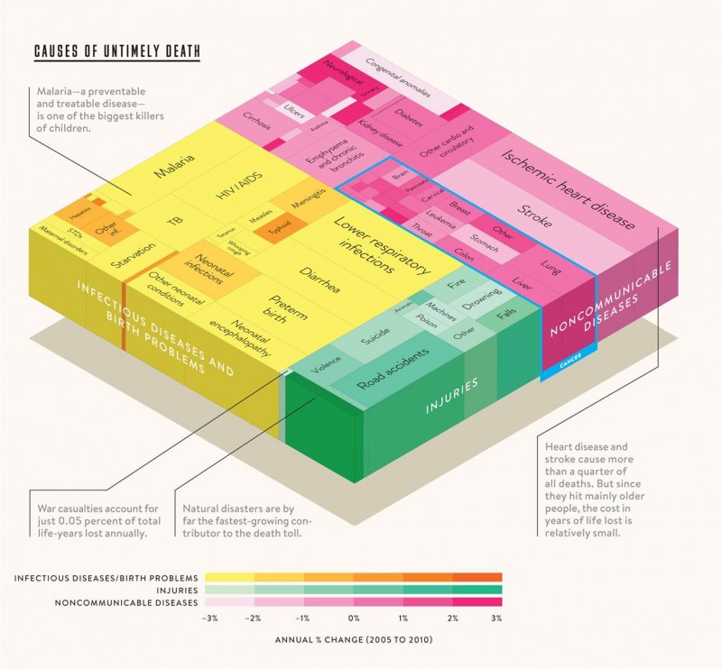
5) Untimely Deaths
This infographic is by Thomas Porostocky and apparently is Bill Gates’ favourite graph of 2013. That big yellow starvation block is a sick joke after watching the US obesity video above.
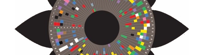
6) Drone Survival Guide
Again, I’m not sure how much use I’ll get out of this but my oh my what a beauty. The Federal Aviation Administration (FAA) predicted that by 2032 there could be as many as 30,000 drones flying over U.S. Soil alone. These bad boys vary in size from 1 m across for a basic commercially available drone up to 40 m across for the Global Hawk.

7) Ocean’s Depths
You may have come across this next graphic before in various formats, but each time I look at it I simply can NOT believe how much scrolling is involved. Truly mind bending, mind boggling and mind numbing… this is the best demonstration of how deep the ocean is without getting your feet wet:

Eye opening WWII death toll stats on next page…