Suggestive Logos Award
For my first ever post, I thought long and hard about what to write about. I considered unravelling probability theory, or perhaps a searingly insightful piece about rare insects in India. But I settled on writing about the best phallic company logos in the world.
I have listed my favourite few and of course given them marks for phallicity (possibly not a real word but it should be). If you need more, there are plenty out there…
Pizza Wang
Pros: nicely subtle but worth it when you find it
Cons: maybe too subtle for some
Phallus points: 20
Syrupy Goodness
Pros: the innocence is astounding
Cons: it makes me feel too peckish
Phallus points: 86
Japanese Multiway
Pros: nice colours
Cons: hard to know exactly what’s going on but it looks like fun
Phallus points: 30
A-Style
Pros: eye-catching colours
Cons: a bit serious
Phallus points: 60
Kudawara Pharmacy
Pros: Simple, clean lines
Cons: I don’t like the colour
Phallus points: 74
Decibel
Pros: great font
Cons: almost too phallic to be true
Phallus points: 66
Ginger Top
Who: Brazilian Institute for Oriental Studies
Pros: everything
Cons: none
Phallus points: 70
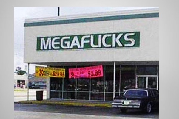
Mega Flicks
Pros: it’s just so very, very bold
Cons: there’s nothing suggestive about it at all
Phallus points: 37
Islam
Pros: classy and nice to see some women parts getting involved
Cons: phallic AND booby – could be confusing
Phallus points: 75
Computer Faux Pas
Pros: it looks more like a wang than a “U” by a long way
Cons: the company’s tag line is rubbish
Phallus points: 88
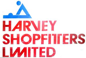
Shop Fitters?
Pros: clear, simple lines
Cons: possibly misleading
Phallus points: 80
Dirty Dancing
Pros: instantly rewarding
Cons: I cant think of any
Phallus points: 82
Dentistry Doo-Dah
Pros: makes me want to go for that check-up I’ve been putting off
Cons: partially obscured by leaves, this may need some maintaining
Phallus points: 85
Randy Aerial
Pros: someone must have done it on purpose?
Cons: someone must have done it on purpose?
Phallus points: 55
THE PROUD WINNER:
Pros: everyone loves those cheeky chimps!
Cons: not sure how successful the breeding will be, think they may have the wrong end of the stick
Phallus points: 95

