When Is A Relationship Most Likely To Fail?

Information is beautiful, a true fact and also the title of an amazing website made by David McCandless. He absolutely loves graphs and charts, and should you. McCandless started out as a graphic designer, which is why he’s so great at making numbers look pretty.
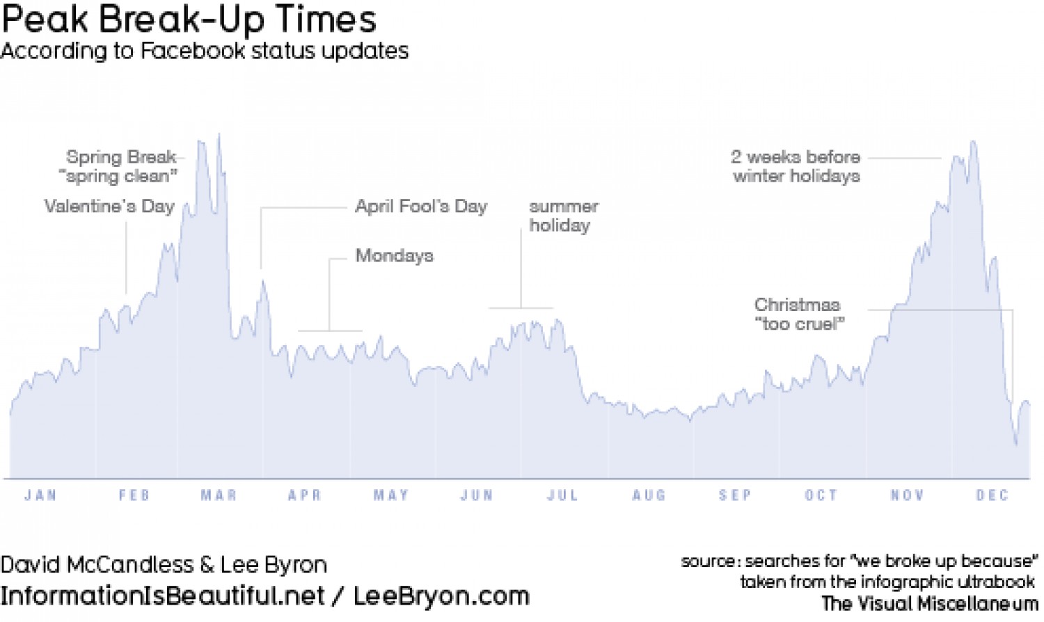
Below is one of his fascinating charts. He took data from Facebook which shows when relationships are most likely to go balls down:
And here he is doing an interesting talk for our pals at TED:
…and here’s an article about another of his great info-pics: